I’m kind of a browser connoisseur. In the past several years, I’ve daily-driven Chrome, Safari, Firefox, Orion, Brave, Edge, DuckDuckGo (MacOS is in private beta), and Librewolf.
All of these browsers have their pros and cons. With Chrome, it’s the convenience and much of the web being built for their engine. Safari fits in my personal Apple ecosystem. Librewolf brings privacy to the forefront.
After trying all of these browsers, I kept coming back to Brave. I like their features, the privacy it comes with out of the box, etc. I’m not a fan of the figurehead behind it, the ties to crypto, or some of the mistakes they’ve made in the past.
The biggest reason I kept coming back was its iOS implementation. Regardless of the fact that every browser on iOS is forced to use webkit under the hood, Brave gives you built-in ad blocking, picture-in-picture for YouTube, the ability to create an offline playlist of videos, and much more.

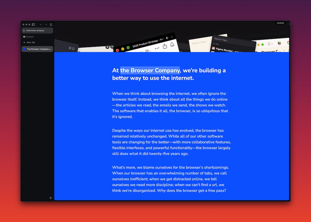
Recently I was given access to Arc browser. A new browser from The Browser Company of New York. That’s a fancy company name making a big promise to provide a “better way to use the internet.”
At first I felt pretty overwhelmed and that the browser had a ton of bloat. But, I quickly realized this browser actually solves some of the problems I’d been facing in other browsers.
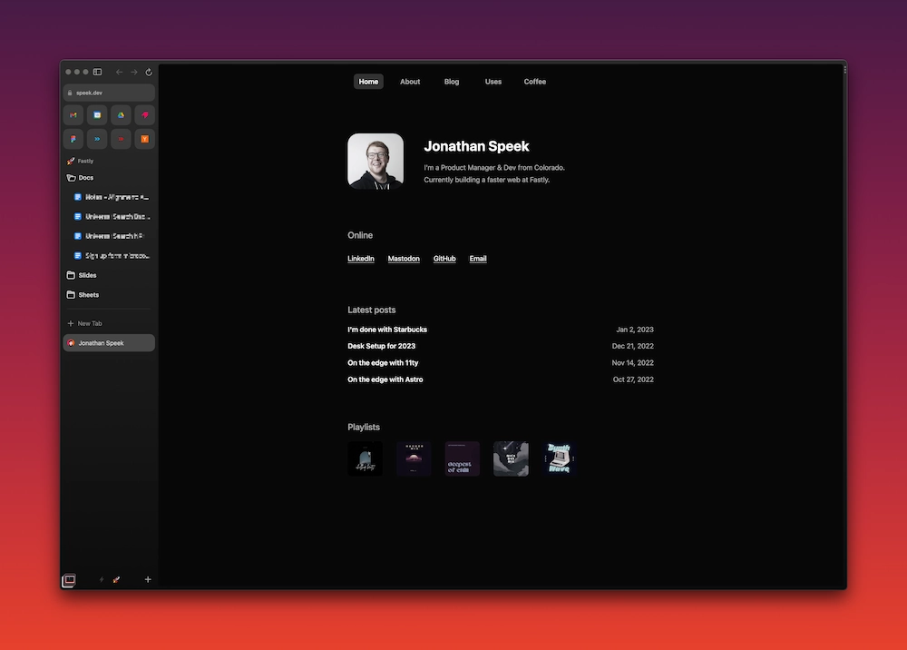
Say you have a Google account at work and you have your personal Google account as well. To keep those separate, you’d have to use different profiles in Chromium browsers. In Firefox, you’d have to use container tabs. In Safari, you’re out of luck. I wanted a hybrid of Chromium and Firefox, where I have the separation that profiles provides, but within 1 window. That’s exactly what Arc gives you. With a quick gesture (two finger swipe), I’m able to switch between spaces (profiles). It’s a little thing, but it’s actually a big game changer for me.

And that’s not even getting started with the cool features this thing has. Another feature that’s brought a decent amount of value to my day-to-day is folders. I used to use tab groups in Chromium & Safari. With folders, it’s the same concept, just in more of a format you’re used to seeing with files and folders. My main gripe with group tabs is the horizontal space (and lack thereof). With the vertical sidebar, I’m able to much more clearly see what tabs are there. I’m even able to change the icon and rename the various tabs!

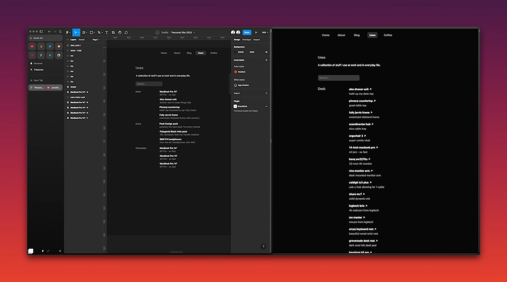
Another unique feature of Arc is split view. In one window you can look at 2+ tabs side-by-side. Sure, you can use a window management tool and split 2 browser windows. But besides cutting it down to a single window - this means when you screen share in apps like Zoom, you can quickly show a Split View without having to share your whole screen. Again, another little detail with large impact.

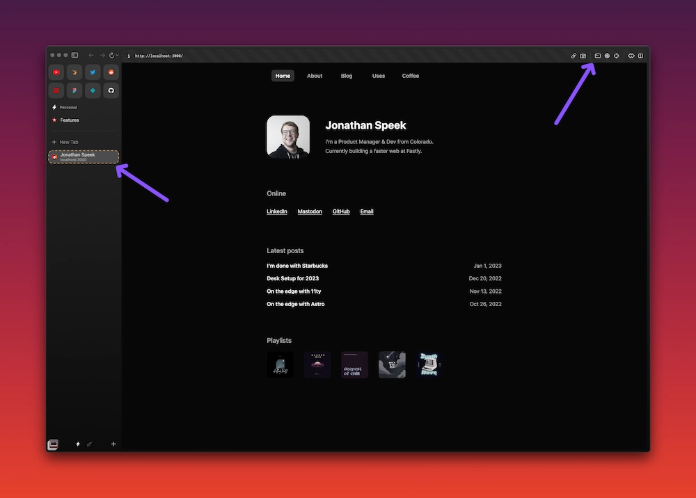
Really quick - look at these cool developer tools they toss-in for localhost!
Along with the plethora of features, the company has an interesting roll-out strategy of using invites. Akin to the launch of Gmail. It’s been fun to handout invites to old colleagues, randoms on Mastodon, etc. People are really excited about [checks notes] a browser again.